Xfinity Entertainment
-
Isabella Dahl / UX Designer
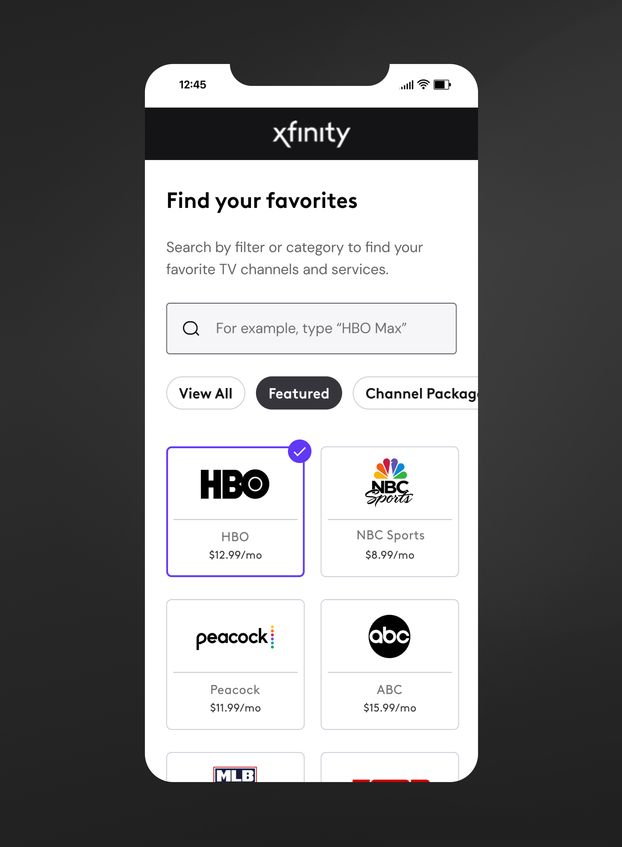
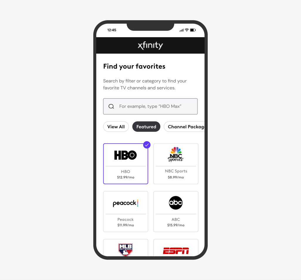
I strategized creative direction, design, and interactive prototypes for the Xfinity Entertainment experience, which enhanced usability by adding filters and generative search features. Redesigned previous TV channels experience to include OTT services and premium service discounts for new and existing Xfinity customers. Completed a design overhaul to transform experience to updated Xfinity branding and design system. Created a comprehensive component library of new OTT and TV channel tiles to scale newly defined tile patterns across Xfinity.com.
-
2021-2022
-
6 months
-
Sketch, Abstract, Invision, Miro, Jira, Microsoft Suite
-
Isabella Dahl / UX Designer
Lisa Hoppes / Creative Director, Aric Tupper / Lead Designer, Natacha Houdegbe / Product Owner, Derek Tracey / Project Manager, Anu Parikh / Research Manager
PROJECT OVERVIEWUpdate the Xfinity Entertainment experience with contemporary brand visuals, typography, and a sleek design language. Ensure the redesigned entertainment experience adheres to and reflects Xfinity's new brand guidelines across the platform. Implement a clear and intuitive catalog of all TV channels, including seamless integration of OTT (Over-the-top) streaming services and tiered subscription options. Leverage user data and insights to improve the overall customer experience, driving higher conversion rates.
Defining the goals
BUSINESS GOALSIncrease conversion rates of prospective Xfinity TV customers by making channel selection simple and quick
Implement OTT Streaming services into the new Xfinity Entertainment experience to drive sales
Streamline the Entertainment page to reduce friction and retain customers within the buyflow.
USER GOALSGive users the ability to quickly and easily find the channels they are looking for, without having to scroll through hundreds of options.
Allow customers to shop and add their favorite streaming services directly from the entertainment hub. Users should be able to compare plans and pricing information to understand the cost benefit of each OTT tier and service.
Customers should have the ability to quickly scan the interactive channel and OTT tiles to see which are included in their plan, which they have selected as add-ons, and which are unavailable to them due to location or TV package.
The Opportunity
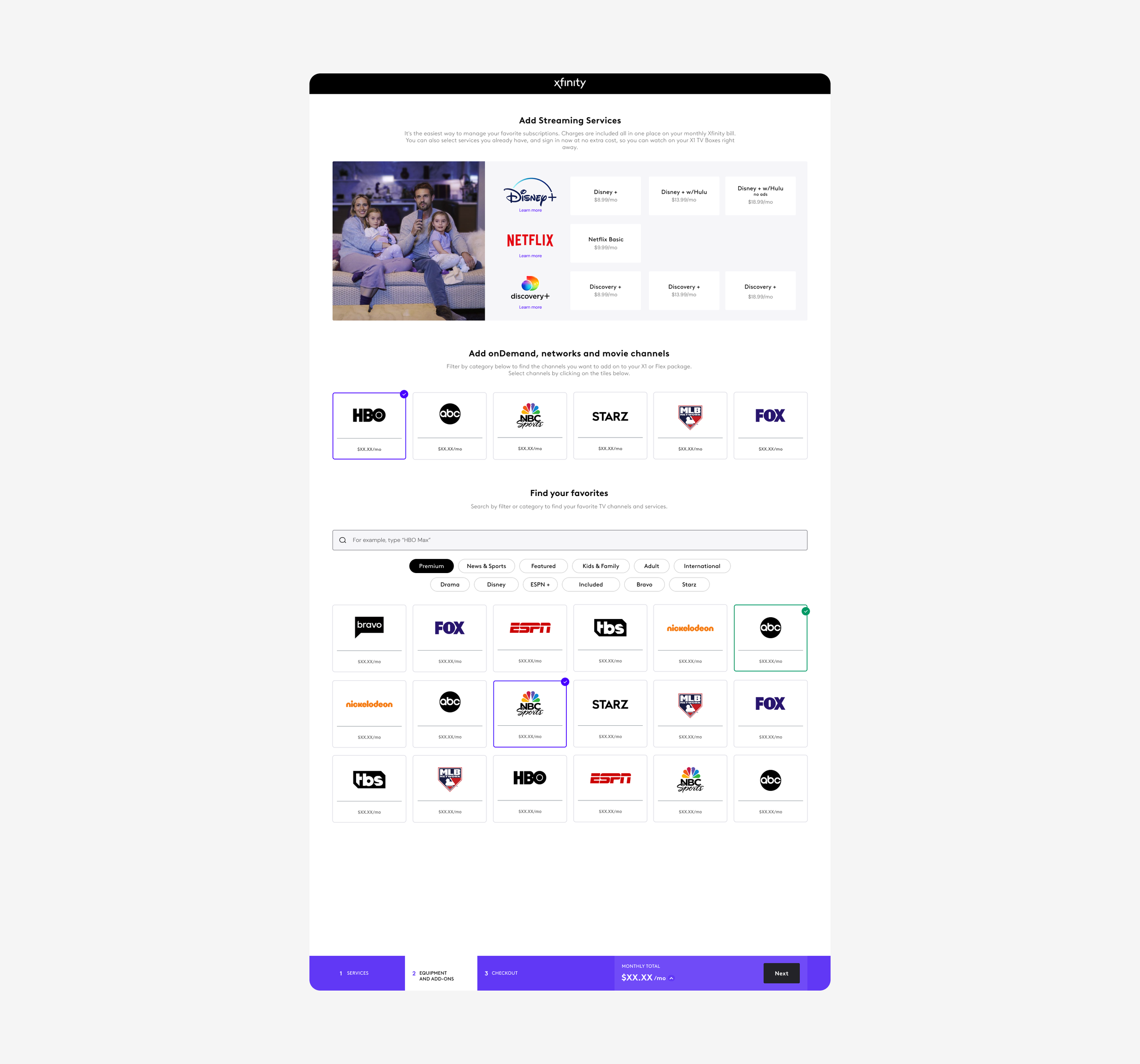
Xfinity knows how each user buys, browses, and discovers on their platform, giving our research team unmatched, intent-based consumer insights. These insights set up our designers, such as myself, to maximize customer experience. To help drive positive change, I designed a brand new version of Xfinity’s Entertainment experience to help drive conversion rates and align with new brand guidelines across the site. It was imperative to create a solution that seamlessly integrated Xfinity Entertainment’s new addition of OTT Streaming packages for customers.
I worked directly with our research team to define gaps in the entertainment management experience, as well as learn about common pain points and frustrations customers experience when navigating through the current TV channel selection process.

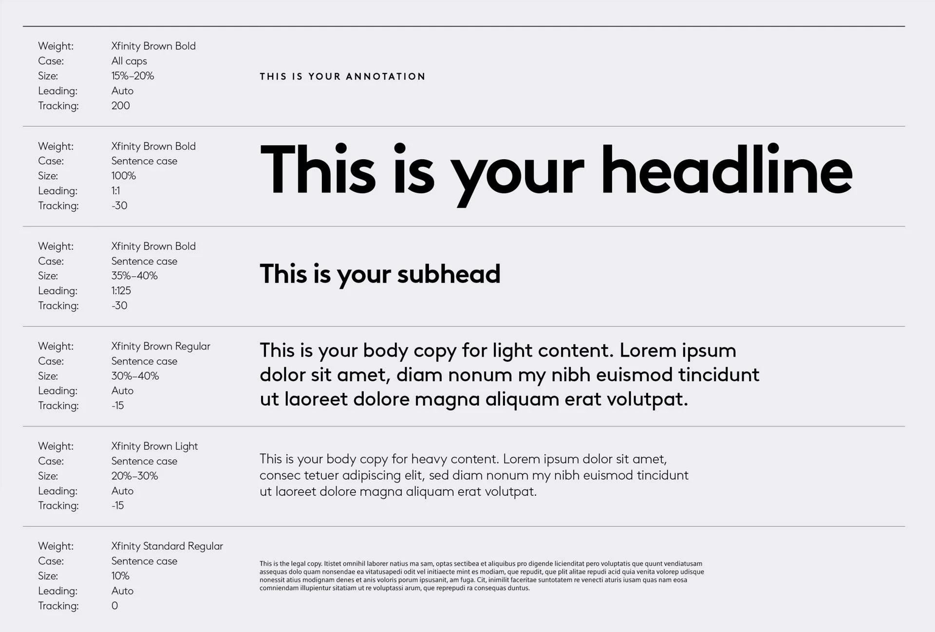
Updated brand identity
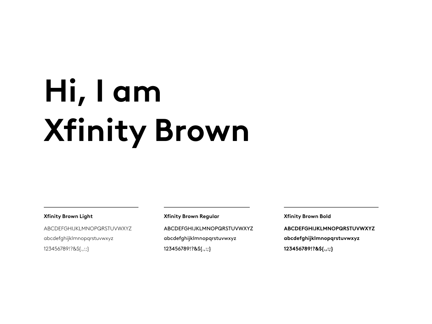
The Entertainment pages were some of the last to be updated with Xfinity’s new 2.0 brand identity and styling. To make this experience feel fluid and consistent, I ensured the redesigned entertainment experience reflects Xfinity's new brand guidelines across the platform.
Tiered OTT integration
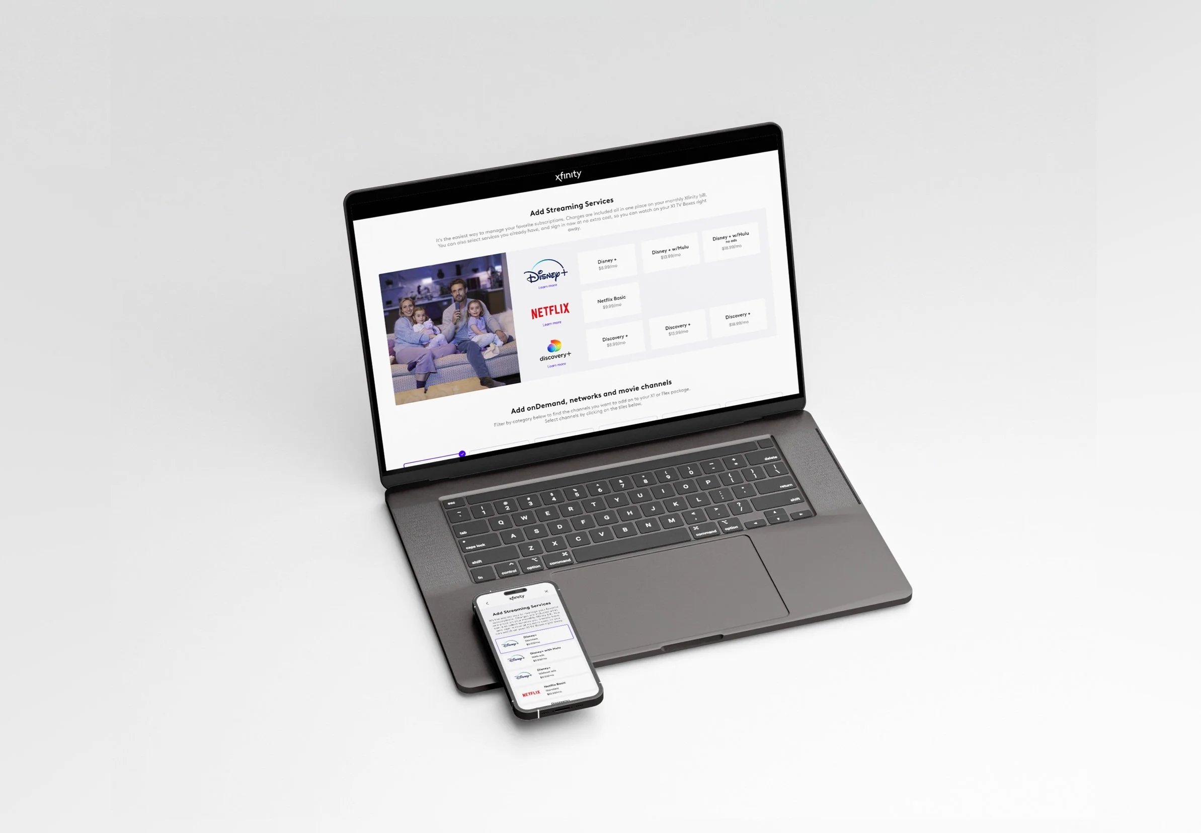
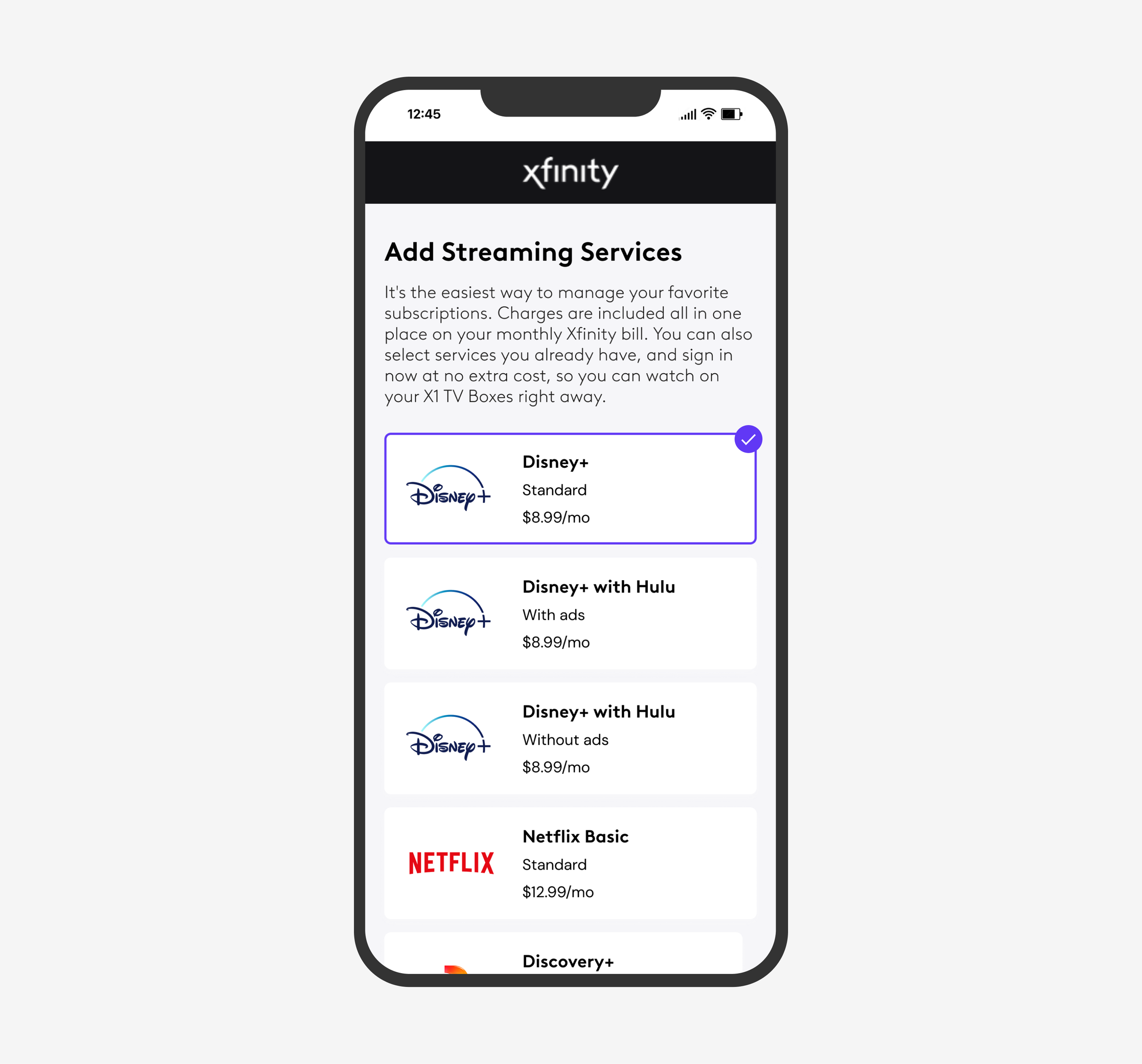
A large part of this effort including integrating tiered OTT streaming services like Disney+ and bundled packages like Disney+ with Hulu.
Advanced search & filtering capabilities
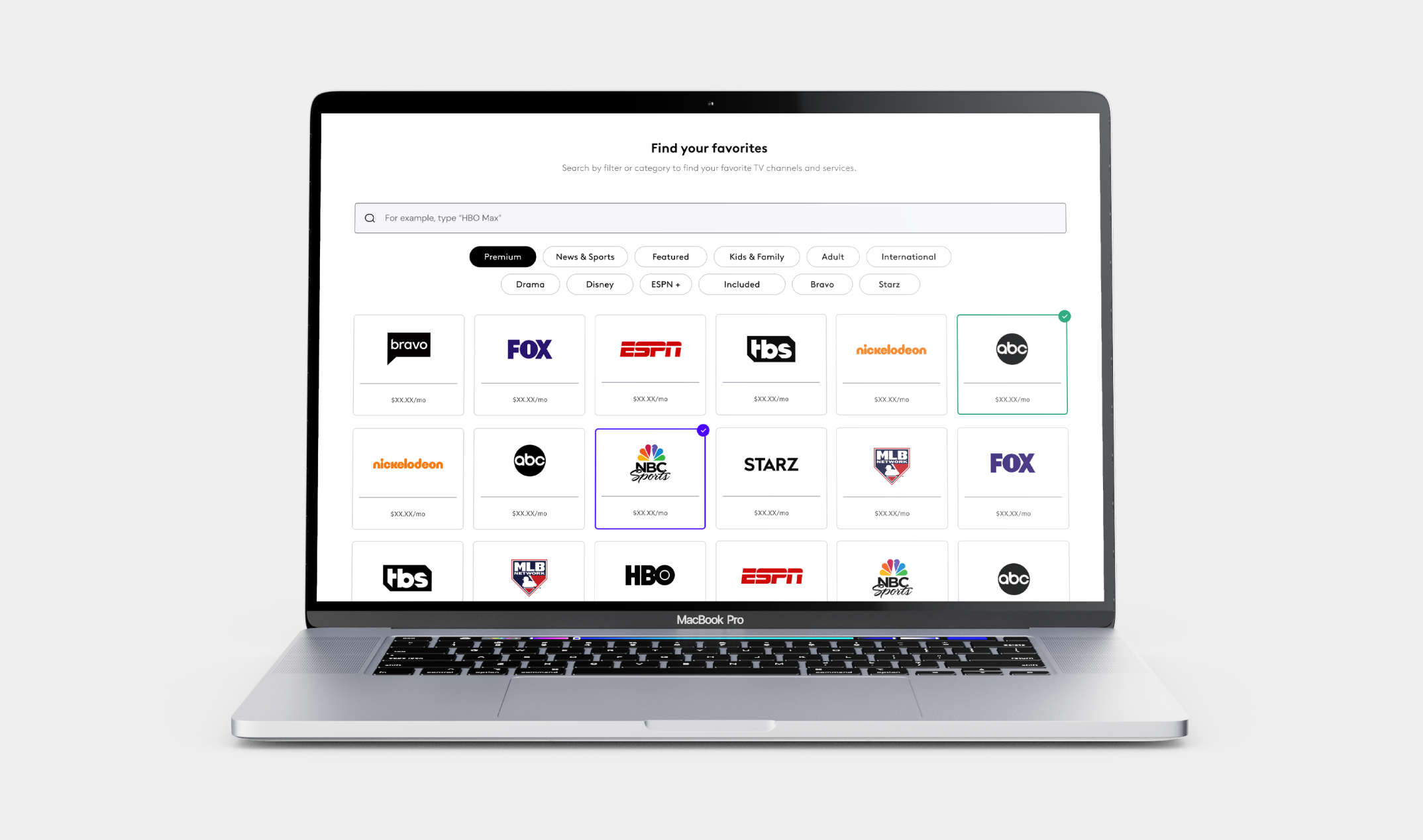
Previously, our TV channel listings were one long, single page housing over 300 channels. This meant users faced an endless scroll to find what they wanted. To address this pain point, I implemented robust filtering and search capabilities. Now, users can navigate effortlessly, pinpointing their desired channels with just a few clicks or taps.
The Key Features
Over the course of the pandemic and onward, our incredible brand team within Xfinity Experience Design worked to rebuild our brand guidelines and components. Our brand team built both a comprehensive and extensive library in what we call “2.0” styling. Our teams external from the brand team have been working to implement these brand updates in a cohesive and aligned strategy across the board.

What pain points did we identify during our research?
-
Most users already know what channels and OTT services they want to add to their TV package upon reaching the channel selection page. The current experience does not allow customers to search for the channel they are looking for, or filter by category to narrow down selection options. This is a huge pain point as it forces customers to scroll through pages and pages of channels to find their desired channel.
-
The current Xfinity Entertainment experience feels disjointed and inconsistent from the rest of the Xfinity Buyflow. Being one of the few experiences that had not yet been updated during the Xfinity 2.0 rebrand, this page felt distinctly out of place within the customer experience. Due to lack of attention, this page also had severe bugs causing logo distortion.
-
Customers were frustrated with the amount of time it took to sort through the hundreds of channel options. Without scrolling through multiple pages to reach each category, customers were unable to view their selections to remember which were included in their plans and which they had chosen as add-ons.
Updated Brand & Component Library
Over the course of the pandemic and onward, our incredible brand team within Xfinity Experience Design worked to rebuild our brand guidelines and components. Our brand team built both a comprehensive and extensive library in what we call “2.0” styling. Our teams external from the brand team have been working to implement these brand updates in a cohesive and aligned strategy across the board. We have worked to determine instruction on varying creative executions (such as where elements can have nuance, versus where we have to align more strictly with the brand guidelines), as well as guidance for brand elements with specific pattern “dos & don’ts”.
Each team rolled out restyling initiatives one-by-one, a strategy used to help make sure content was aligned and patterns were being followed correctly across the board. My team, which handles all things related to consumer purchases of equipment and services, was the last to rollout 2.0 styling.
